Exercises
Information Design: Redesigning a diagram for clarity in a poster format. For the poster, I made sure to make every circle on the orbital path an image of the Earth to reduce confusion. I also added the time period between the pairs of Earths to further explain what is the equal area. Lastly, I spaced out the dots on the orbital path to show how the Earth moves faster when closer to the Sun and slower when further from the Sun--which is how those two areas equal out.
Design Materials, Processes, and Production Booklet
Food Experience Sketchbook
Front Cover

Food Experience 1
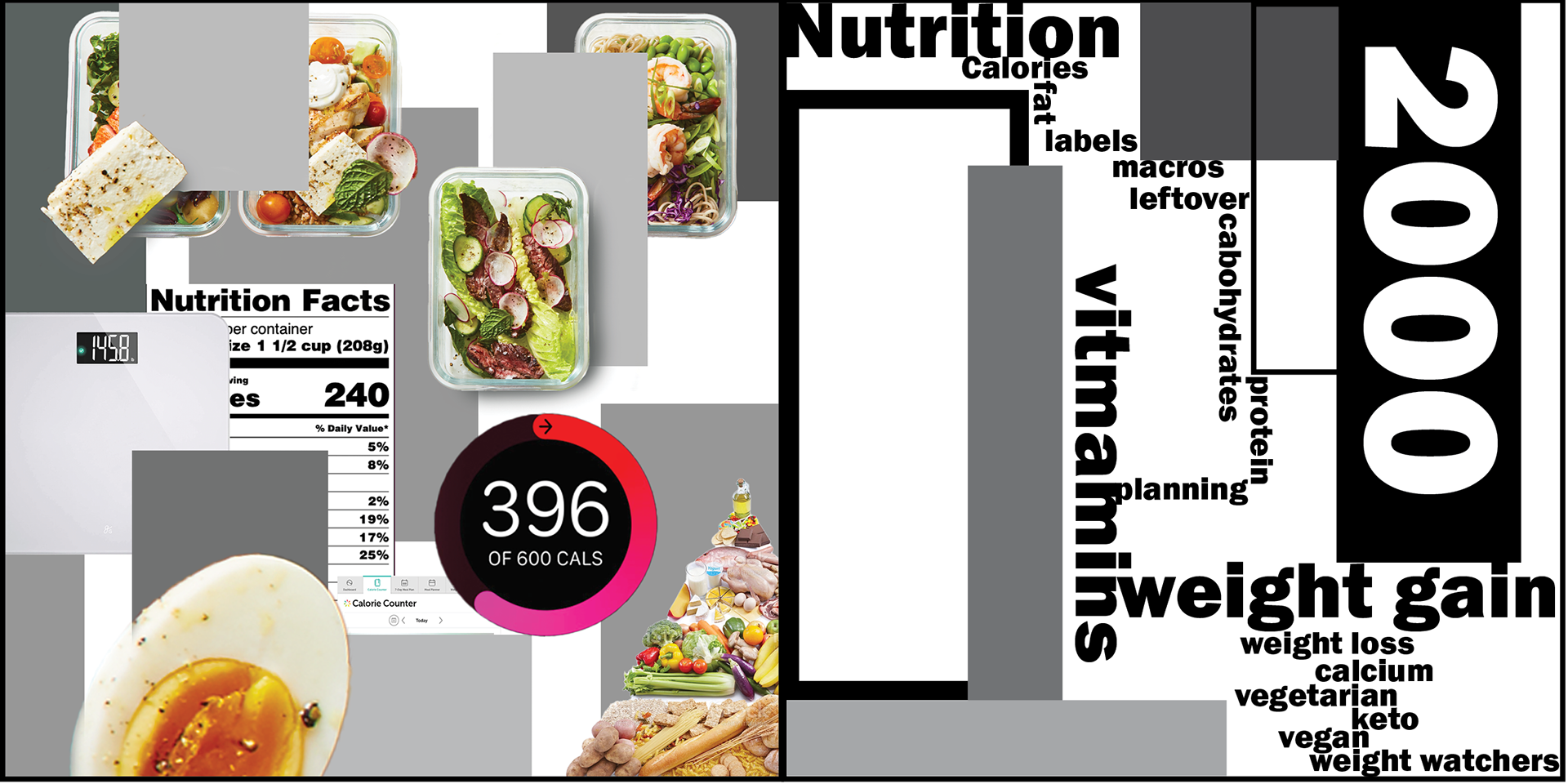
Food Experience 2
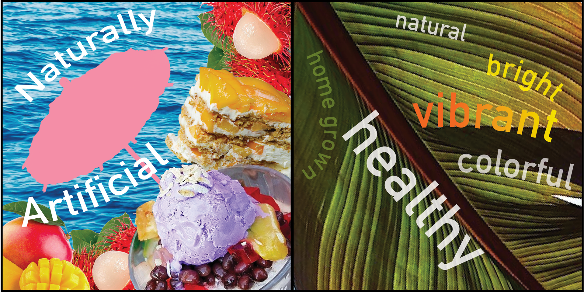
Food Experience 3

Food Experience 4
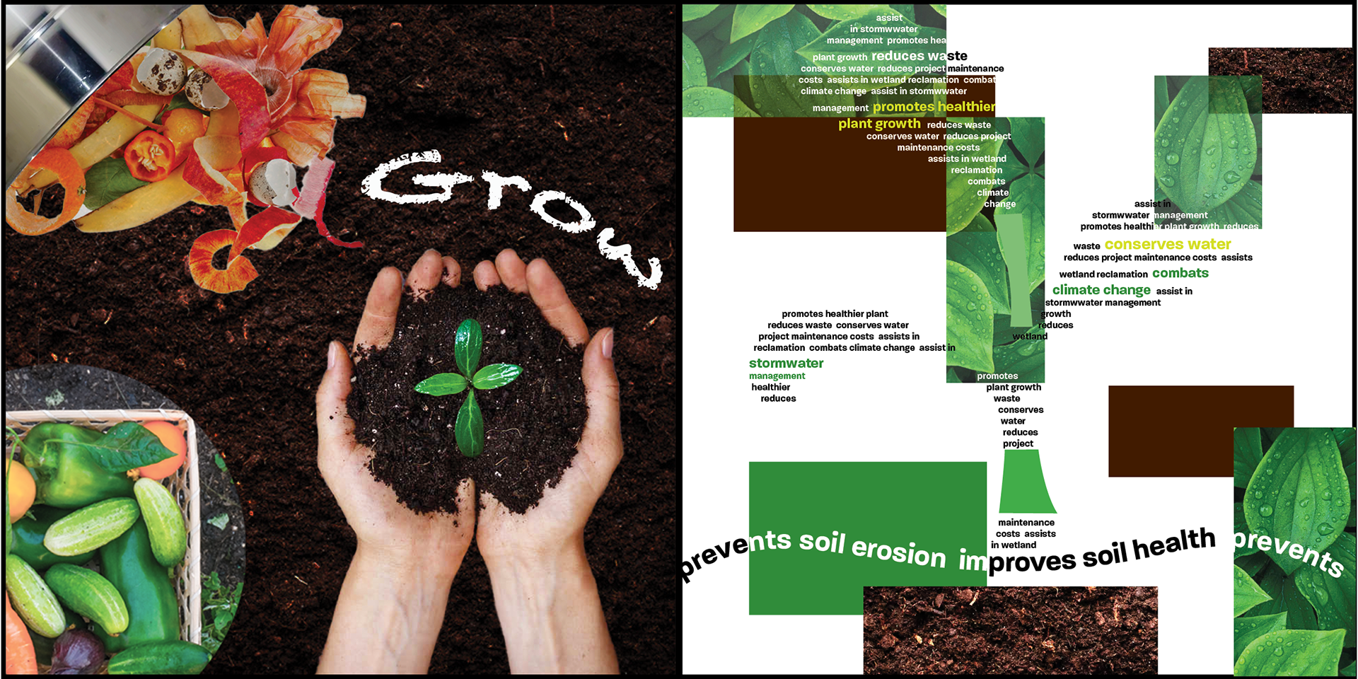
Food Experience 5

Back Cover
Form and Rhythmic Progression
Design Media: After Effects
Words in Action: Silent
Words in Action: With Sound
Netflix Retro Redesign
Ohio Historical Society: The Immigration Experience
Design Research: The LEGO Experience
Lego Site and Assembly
Observation and Journey Mapping
Surveys and Interviews
Design Foundations
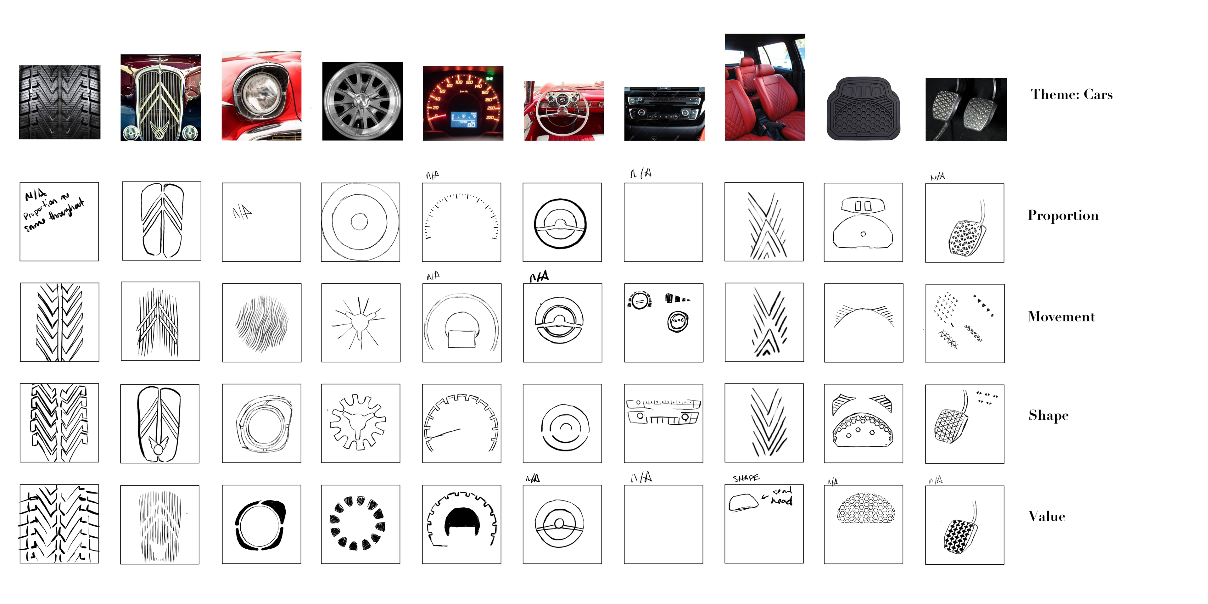
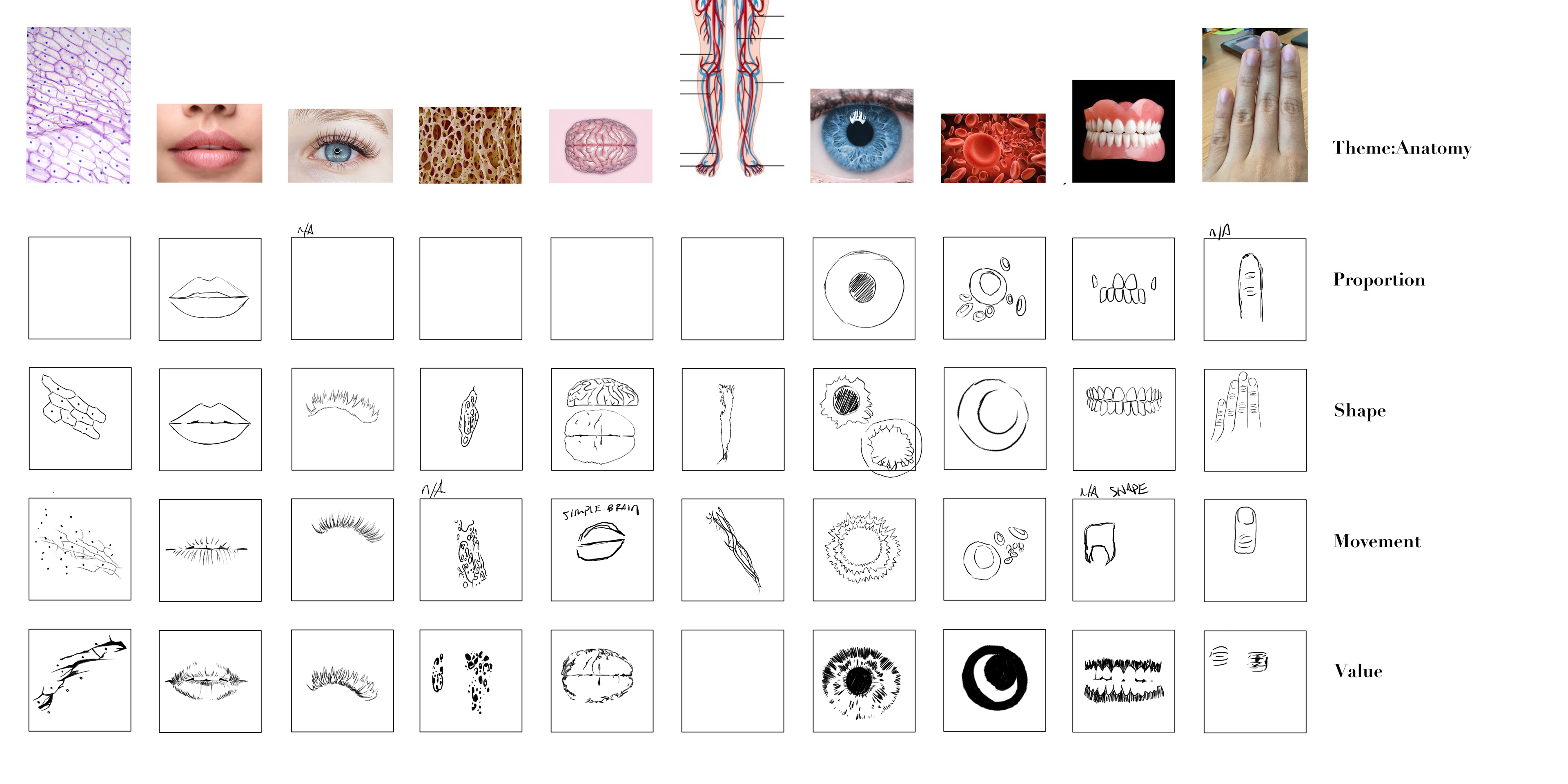
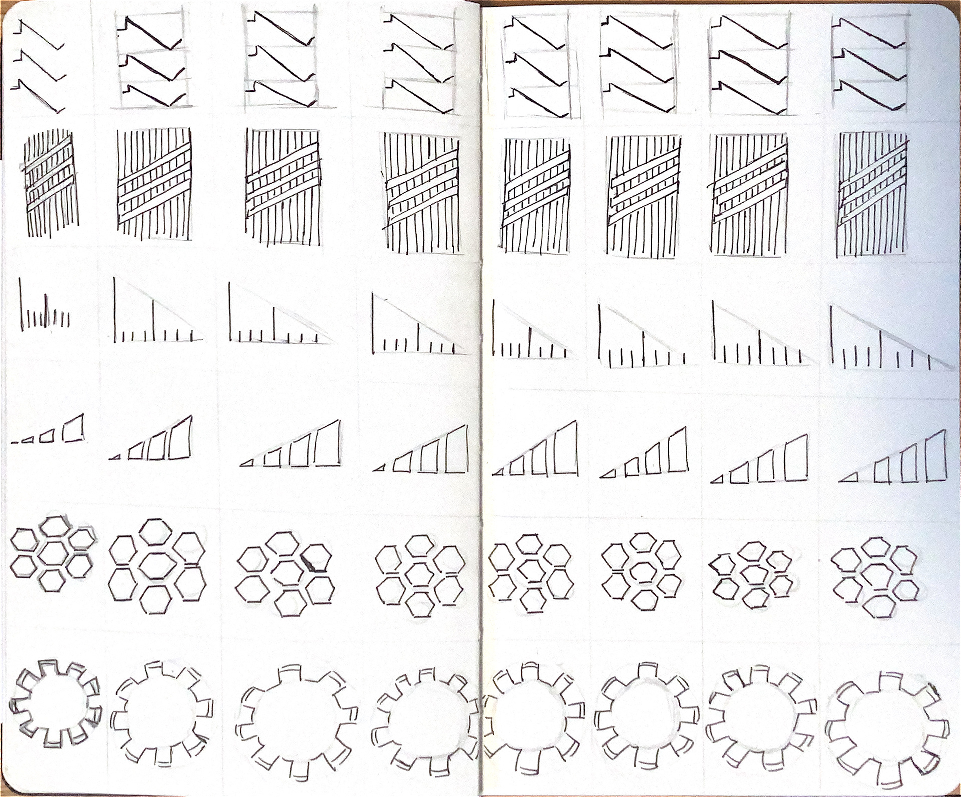
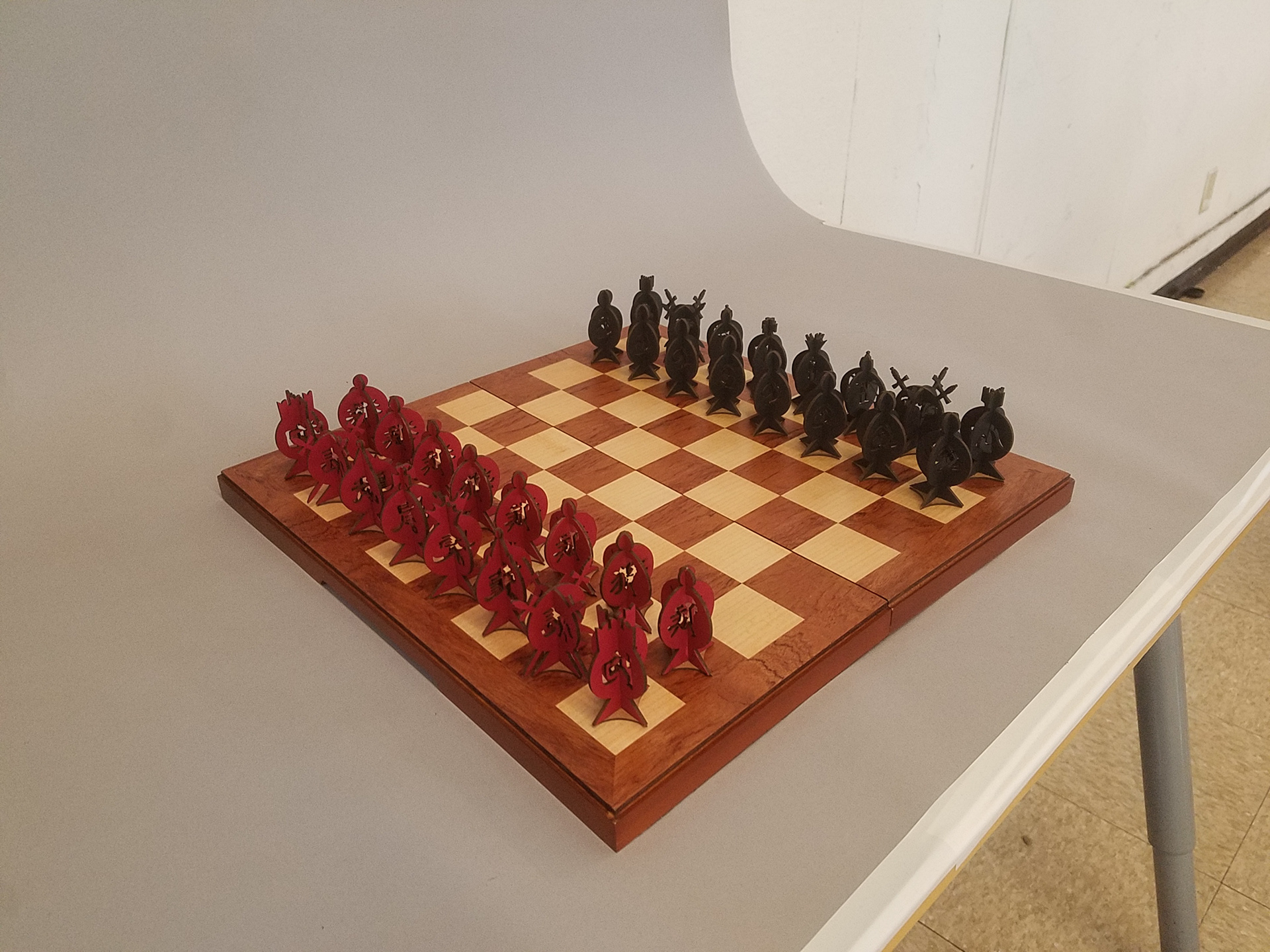
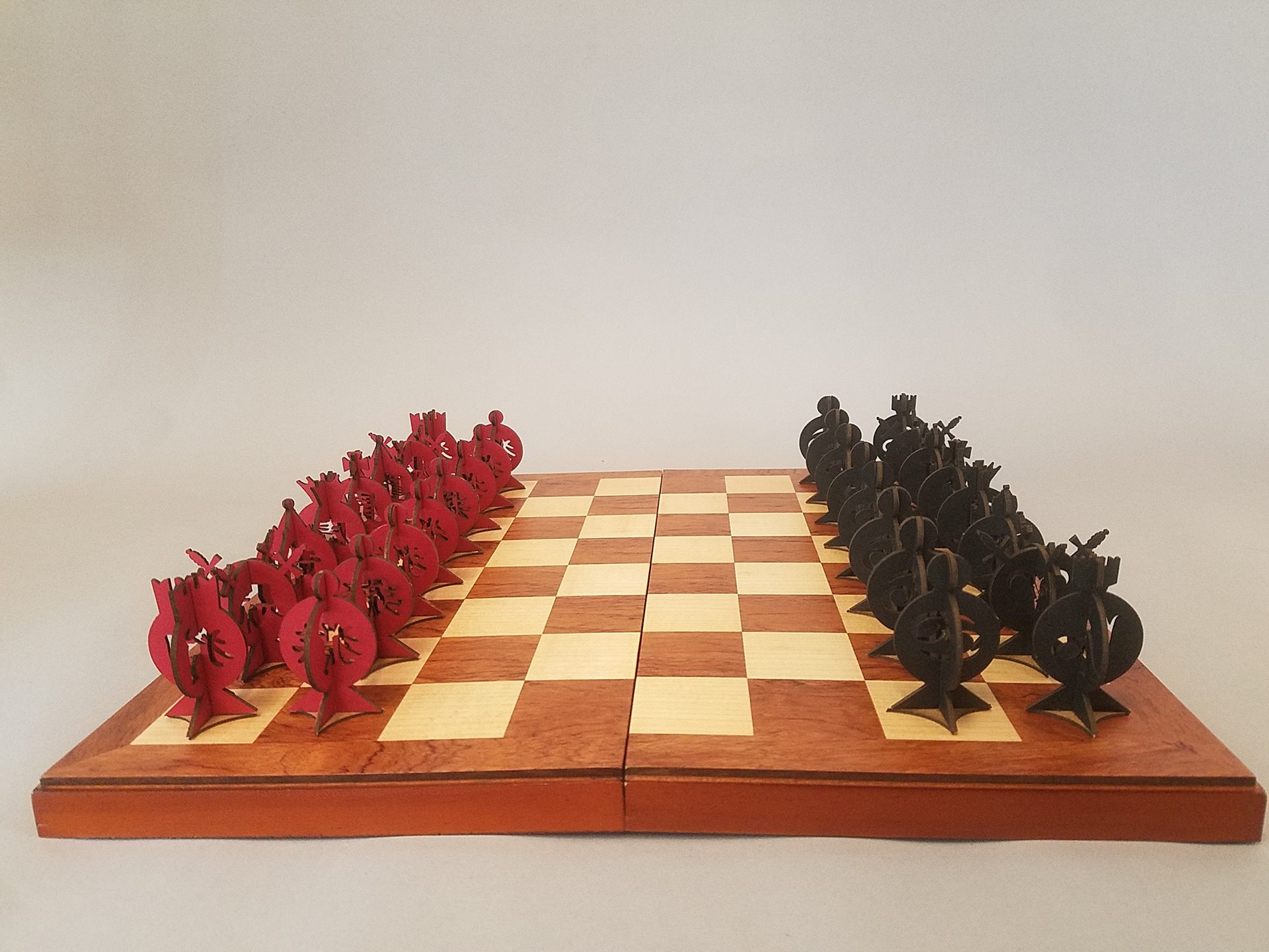
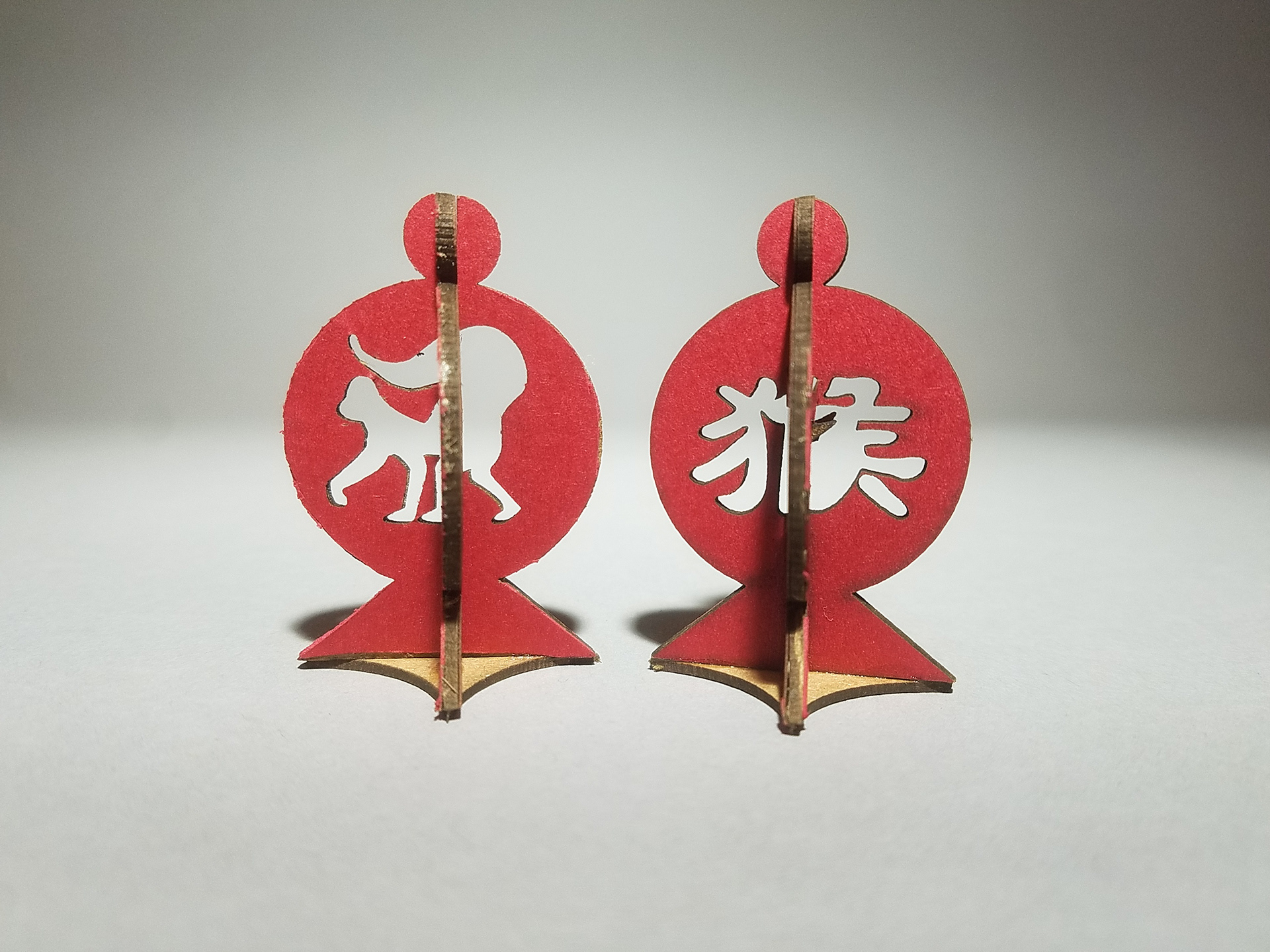
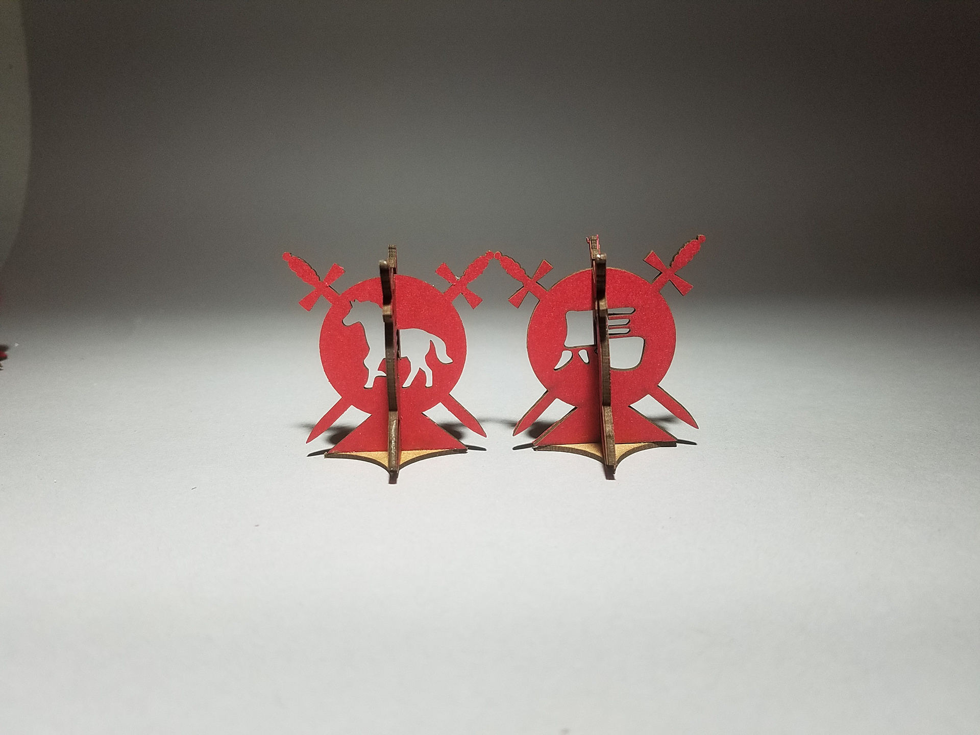
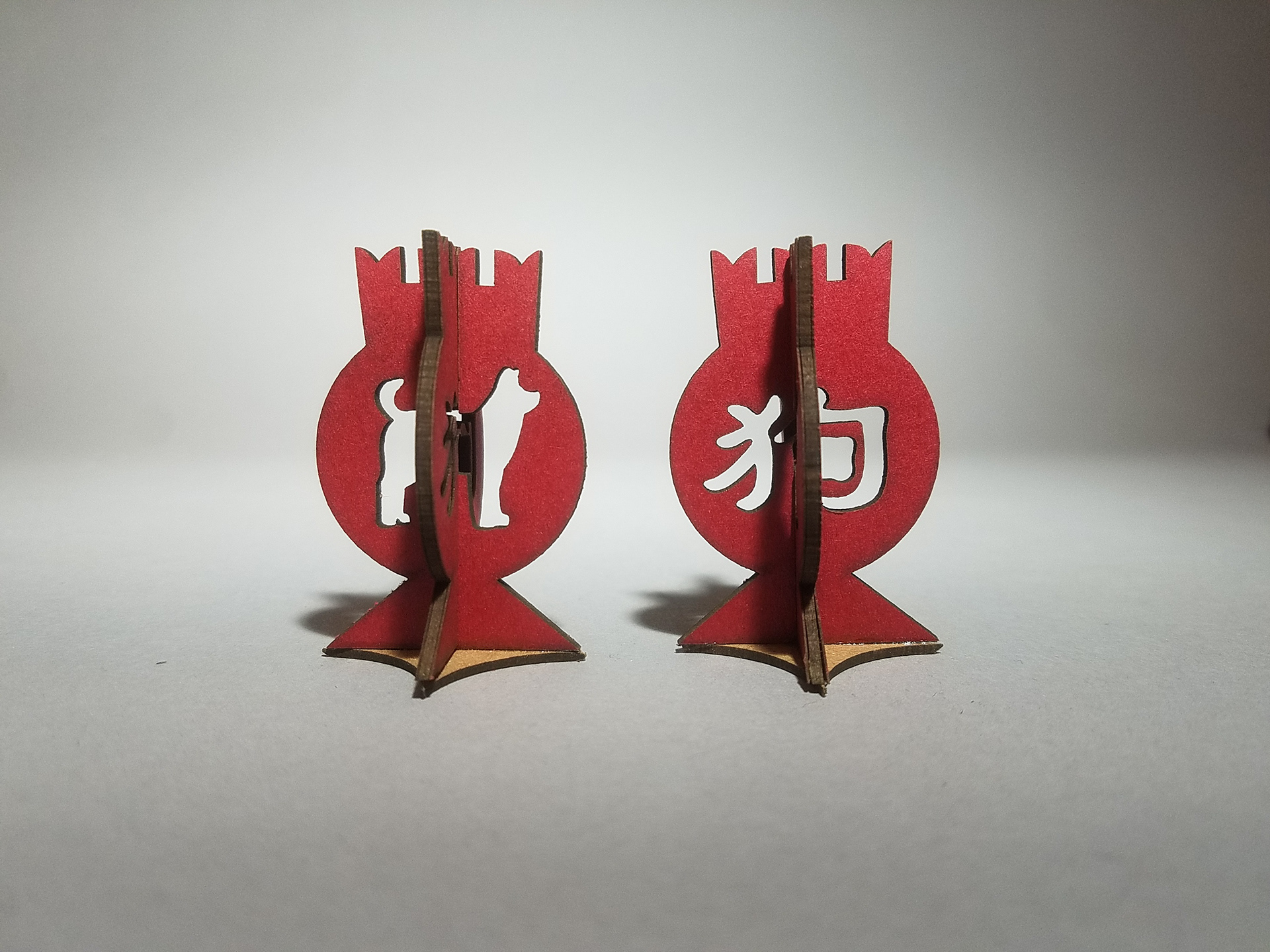
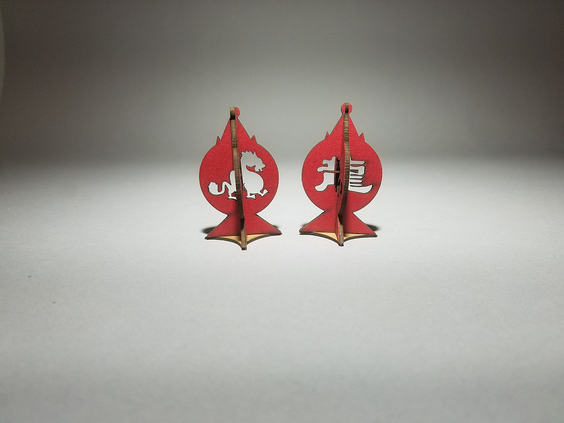
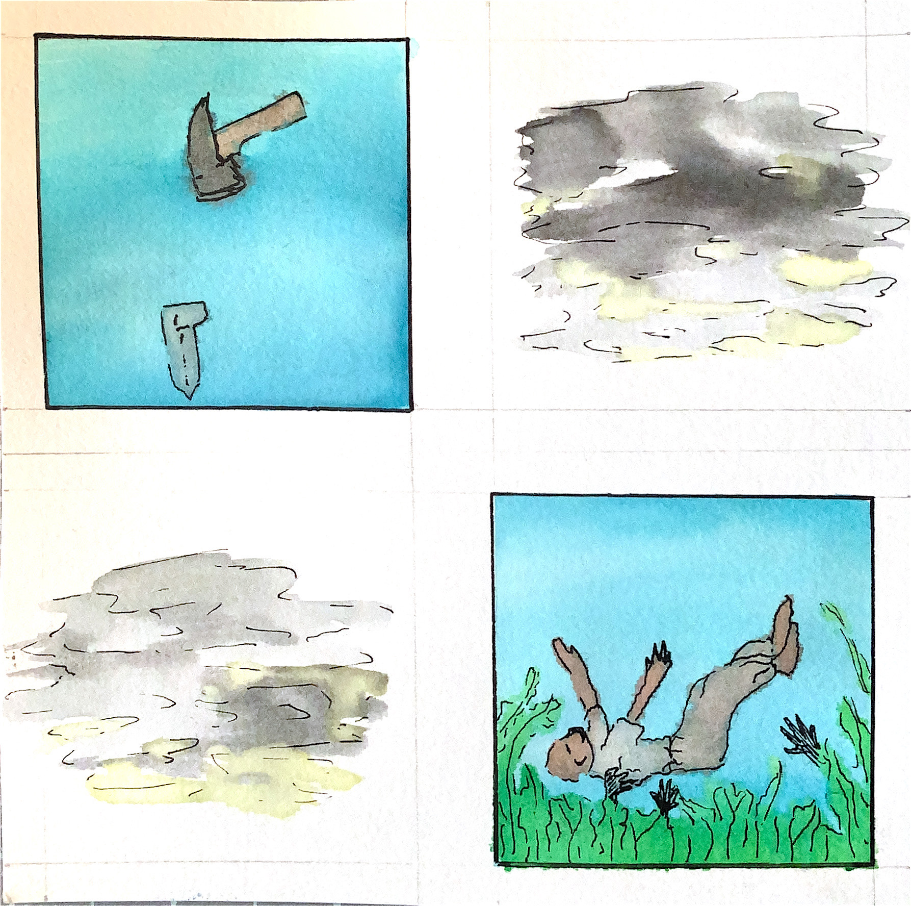
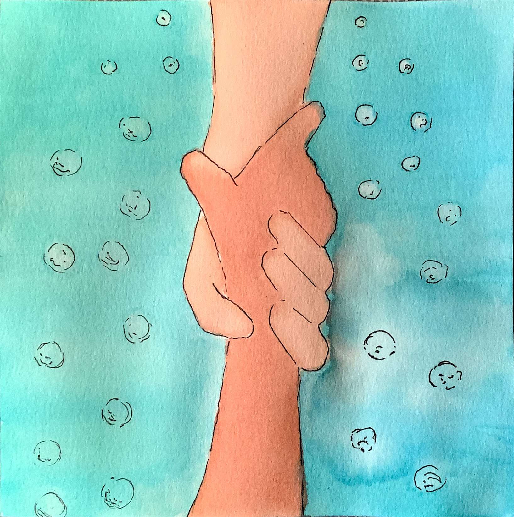
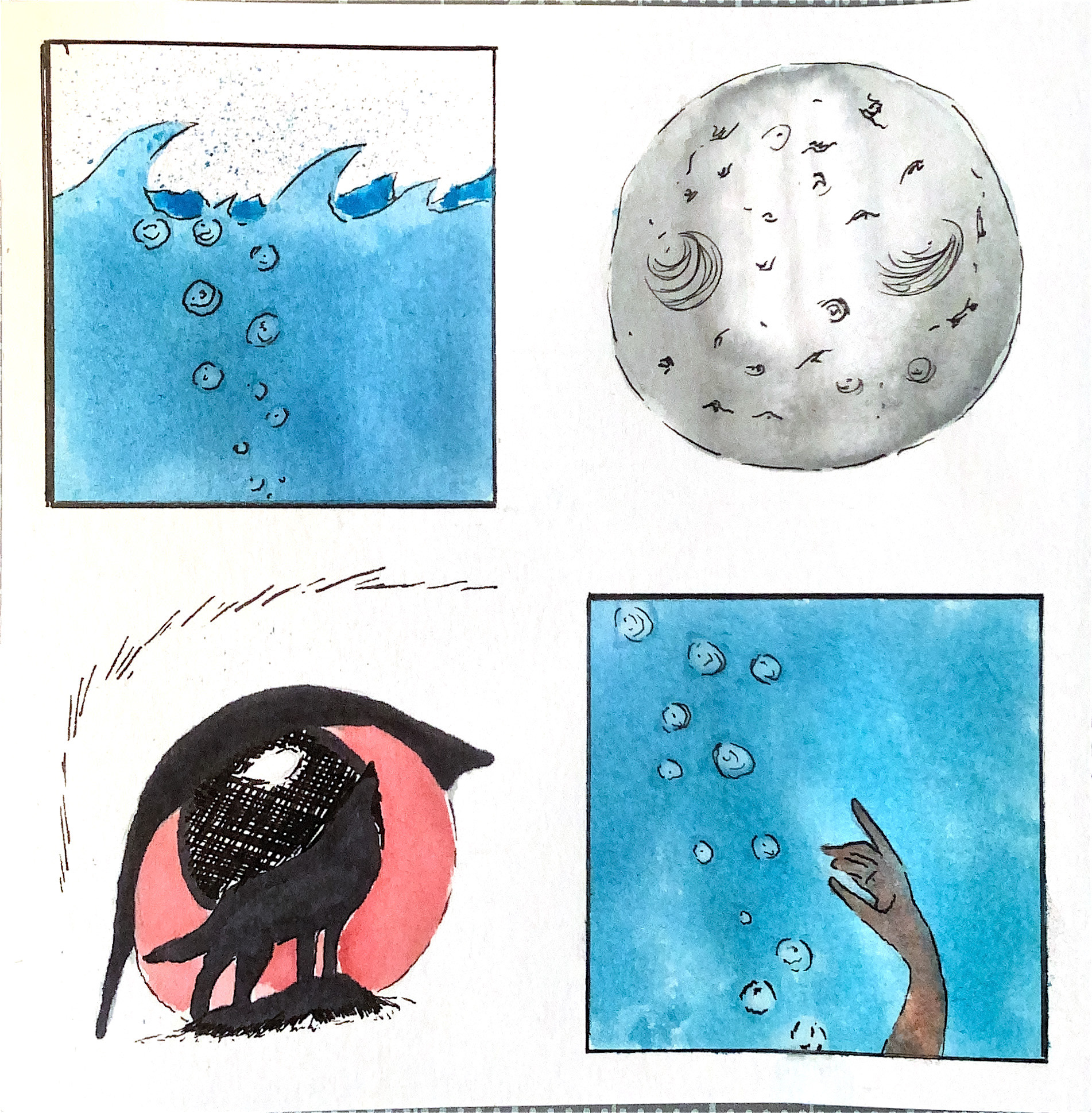
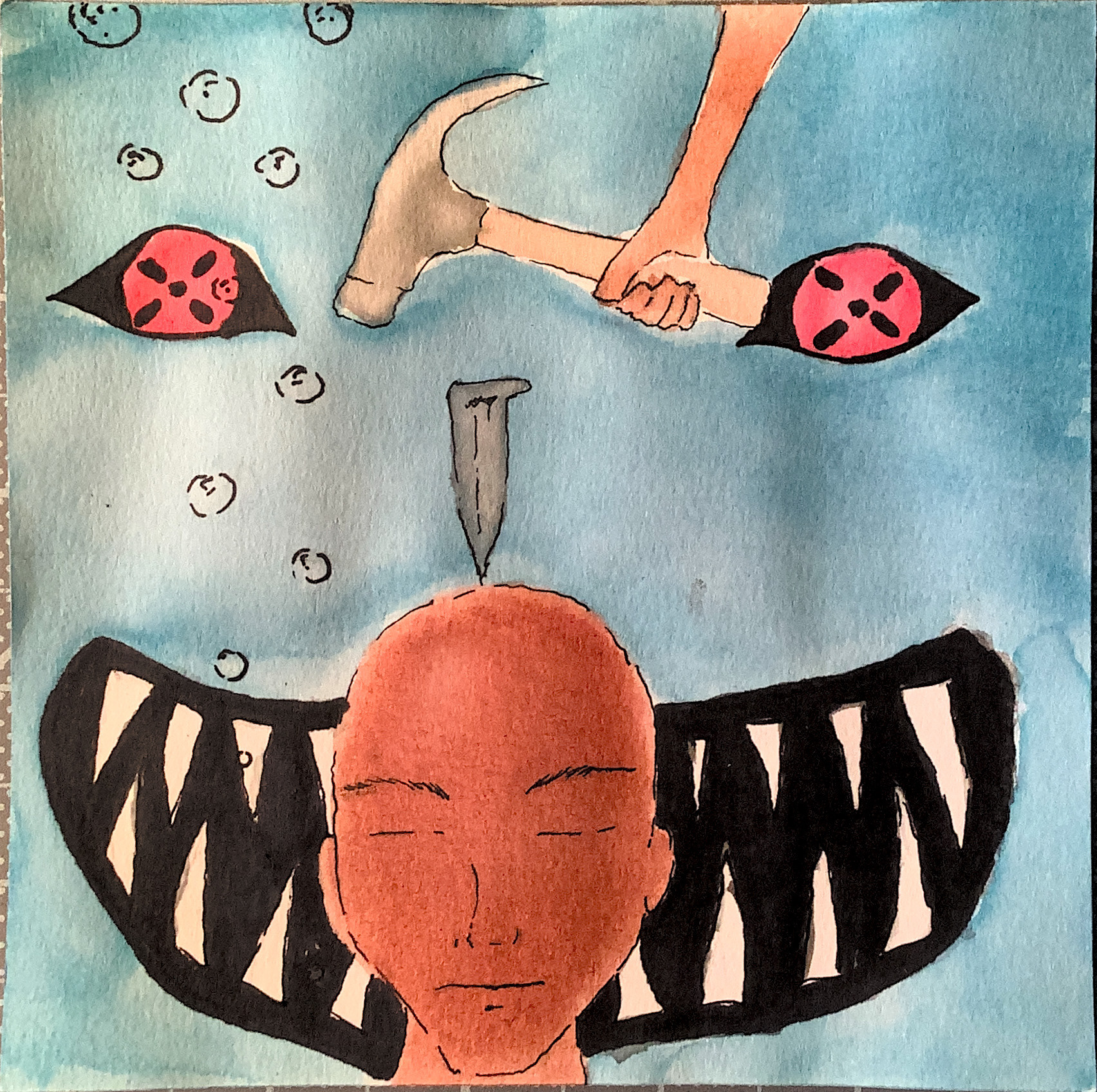
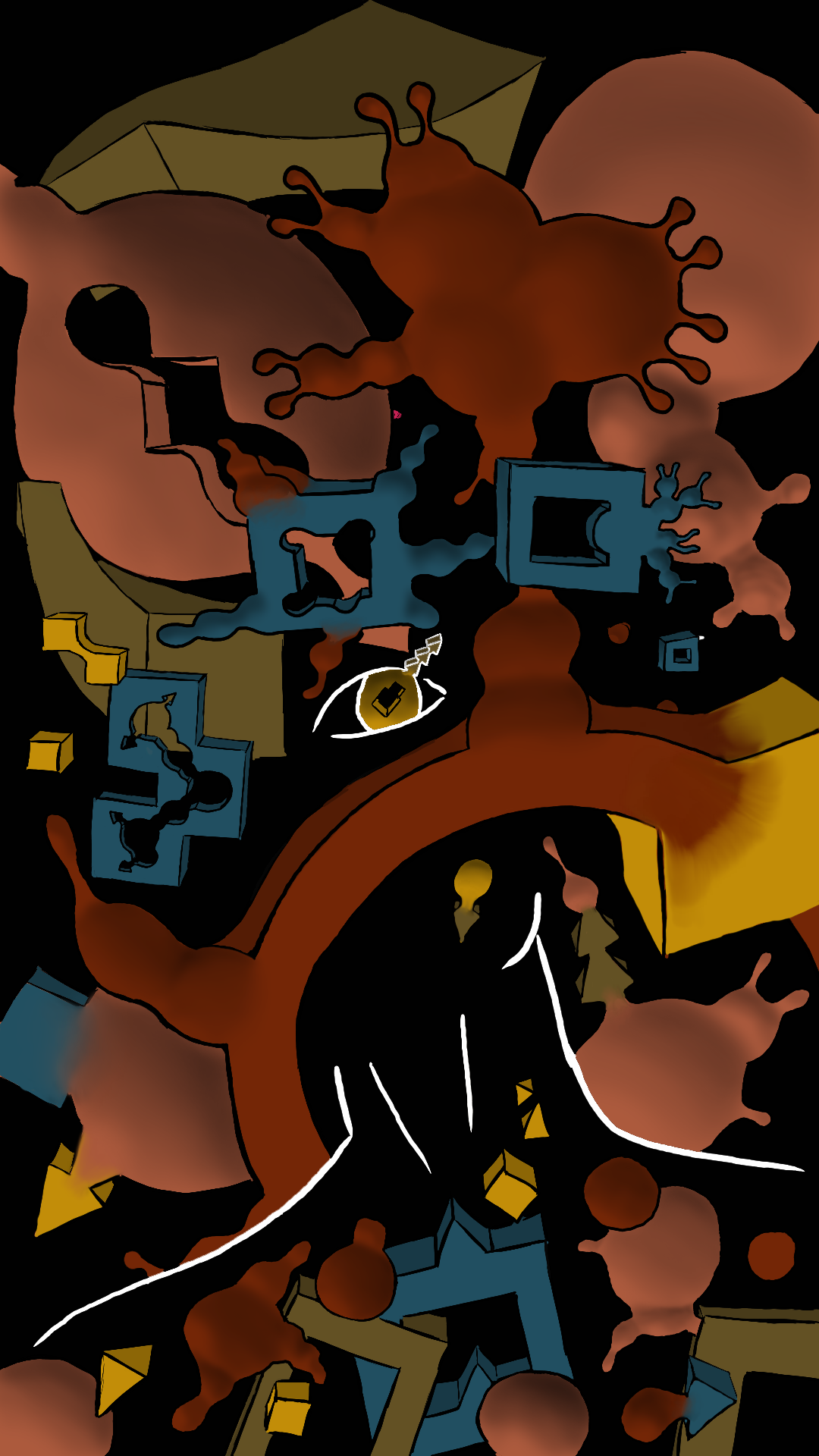
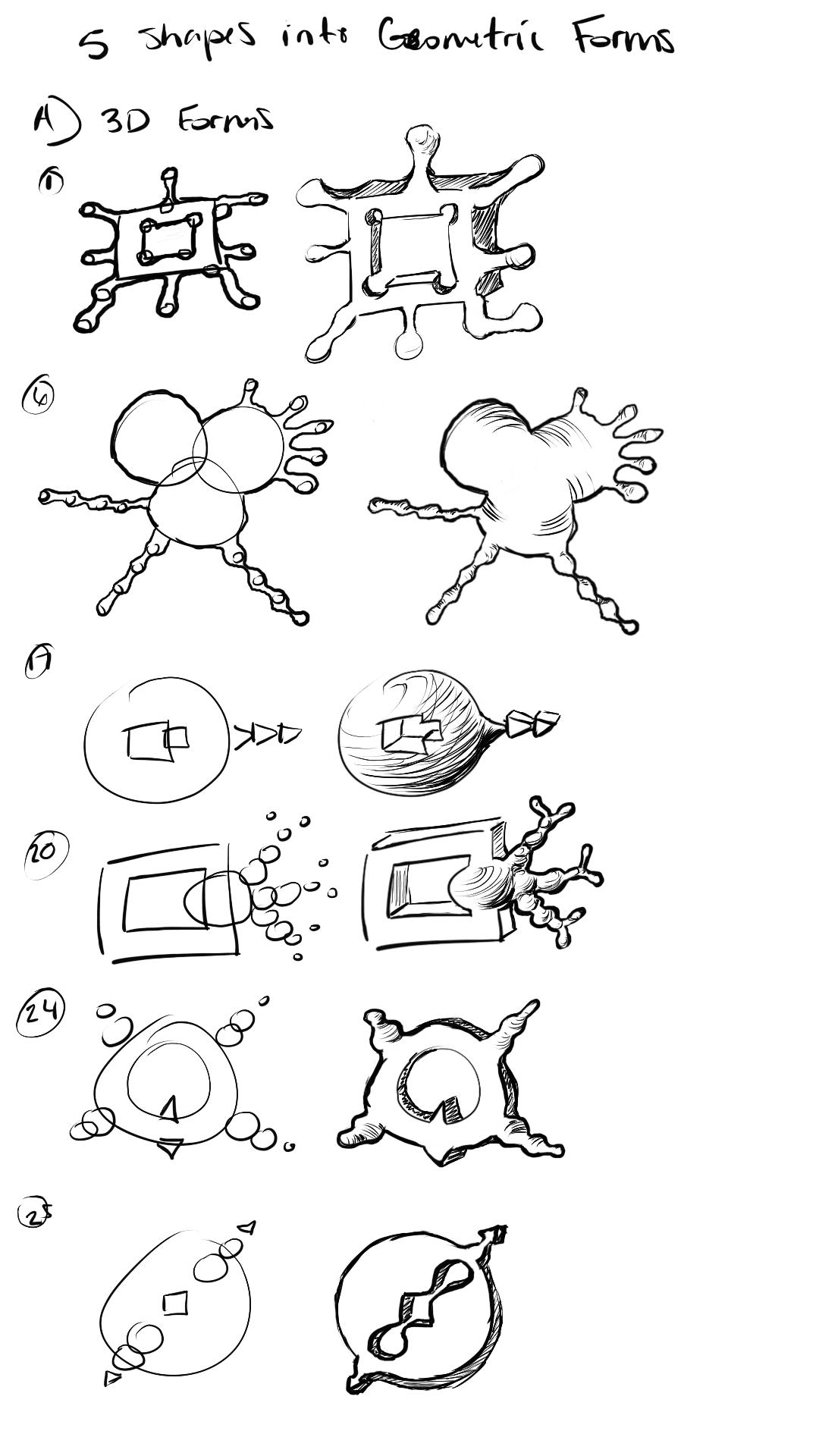
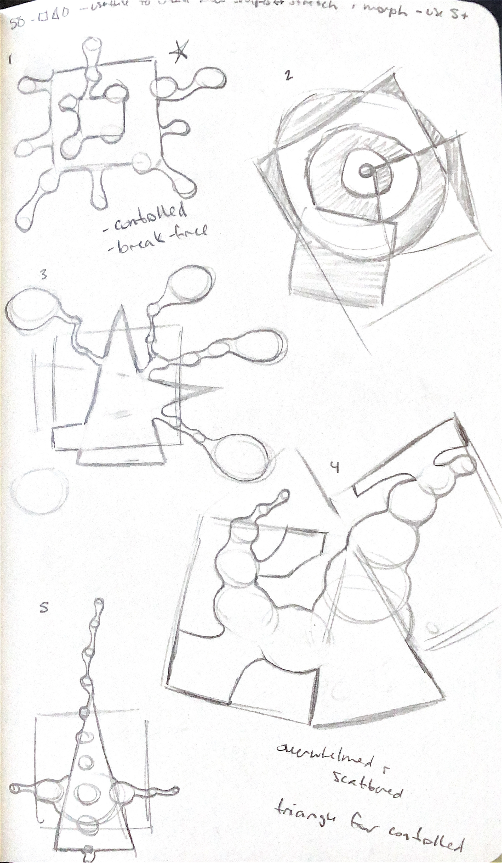
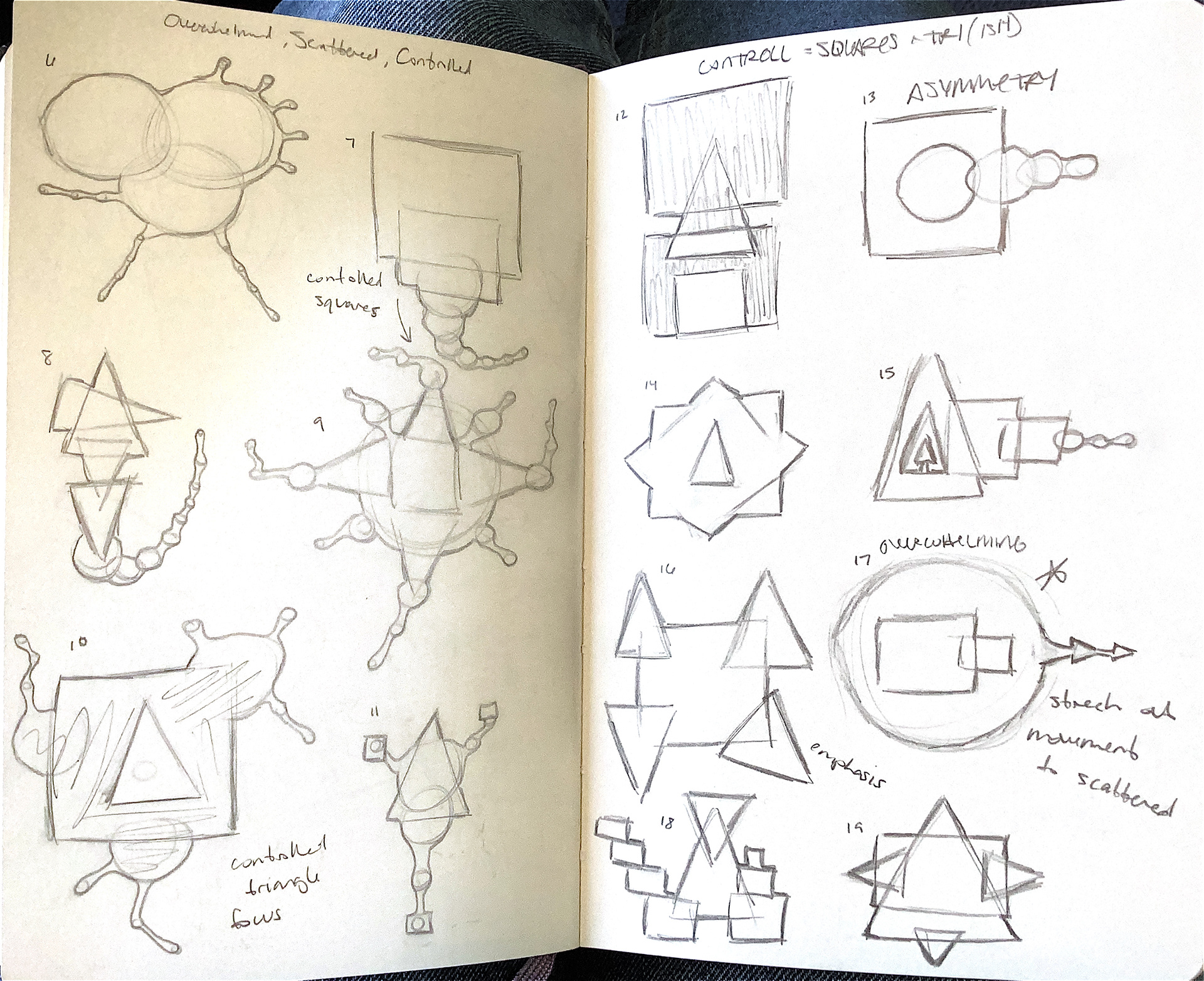
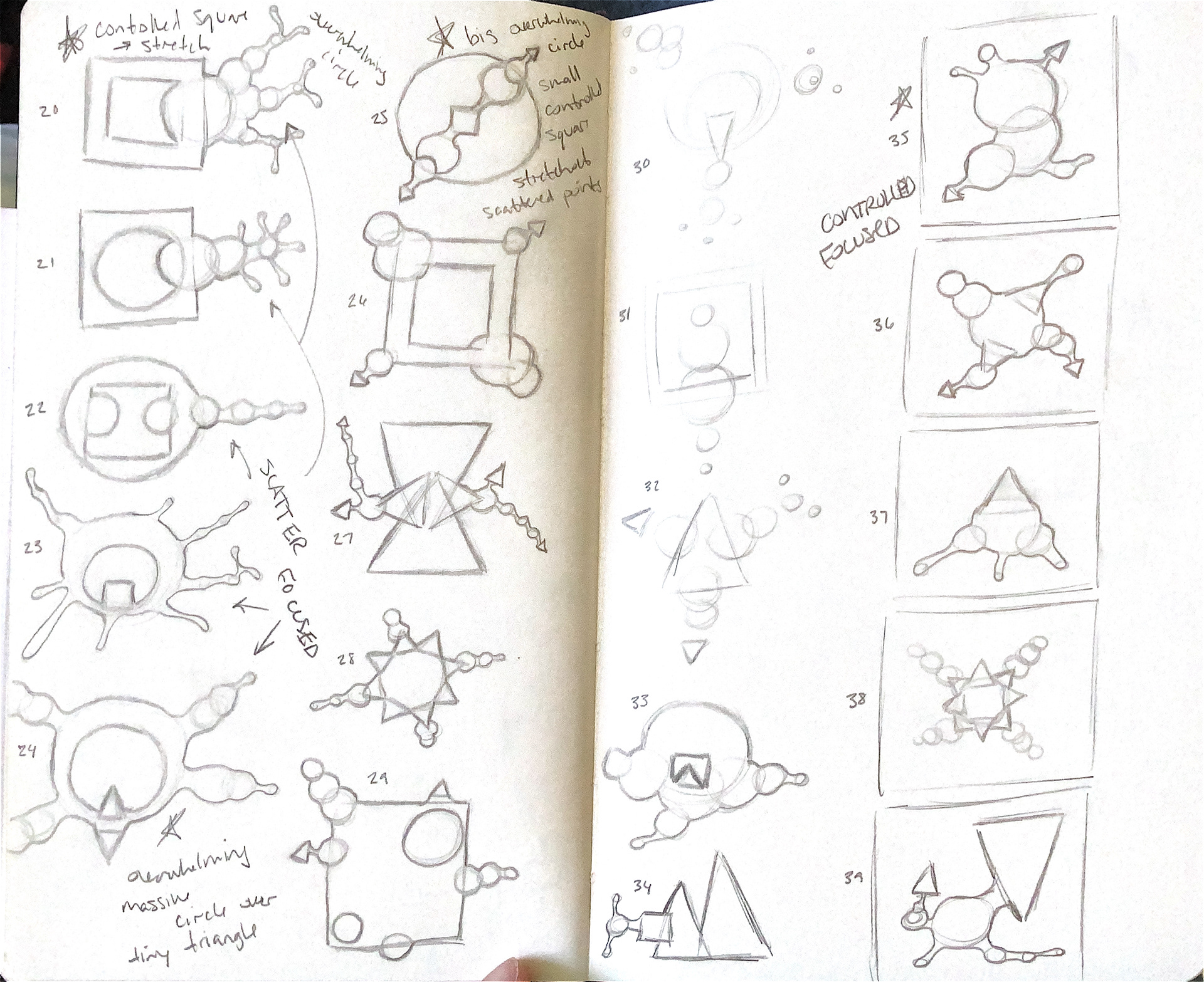
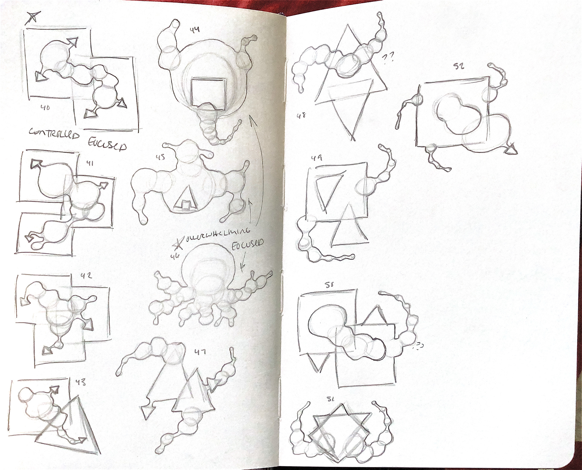
My Foundations site was created using WordPress. The site was created with the purpose of admittance into the Visual Design Program at OSU.