Role
2nd Year Student
Timeline
Autumn Semester 2022
Overview
This class explored the different ways in which text can be manipulated within a square spread. The final book is comprised of 13 different exercises completed throughout the autumn semester of my second year in the design department at tOSU.
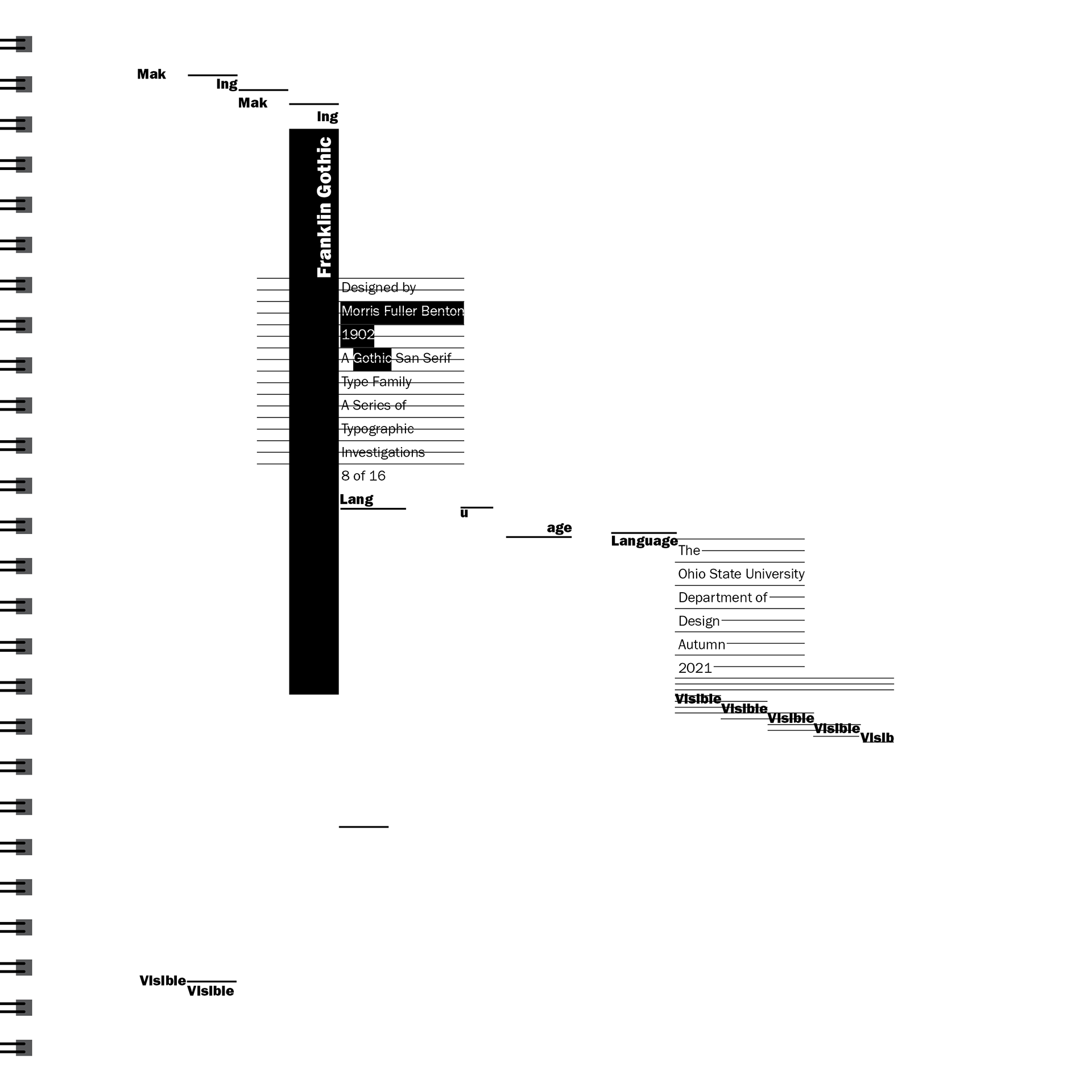
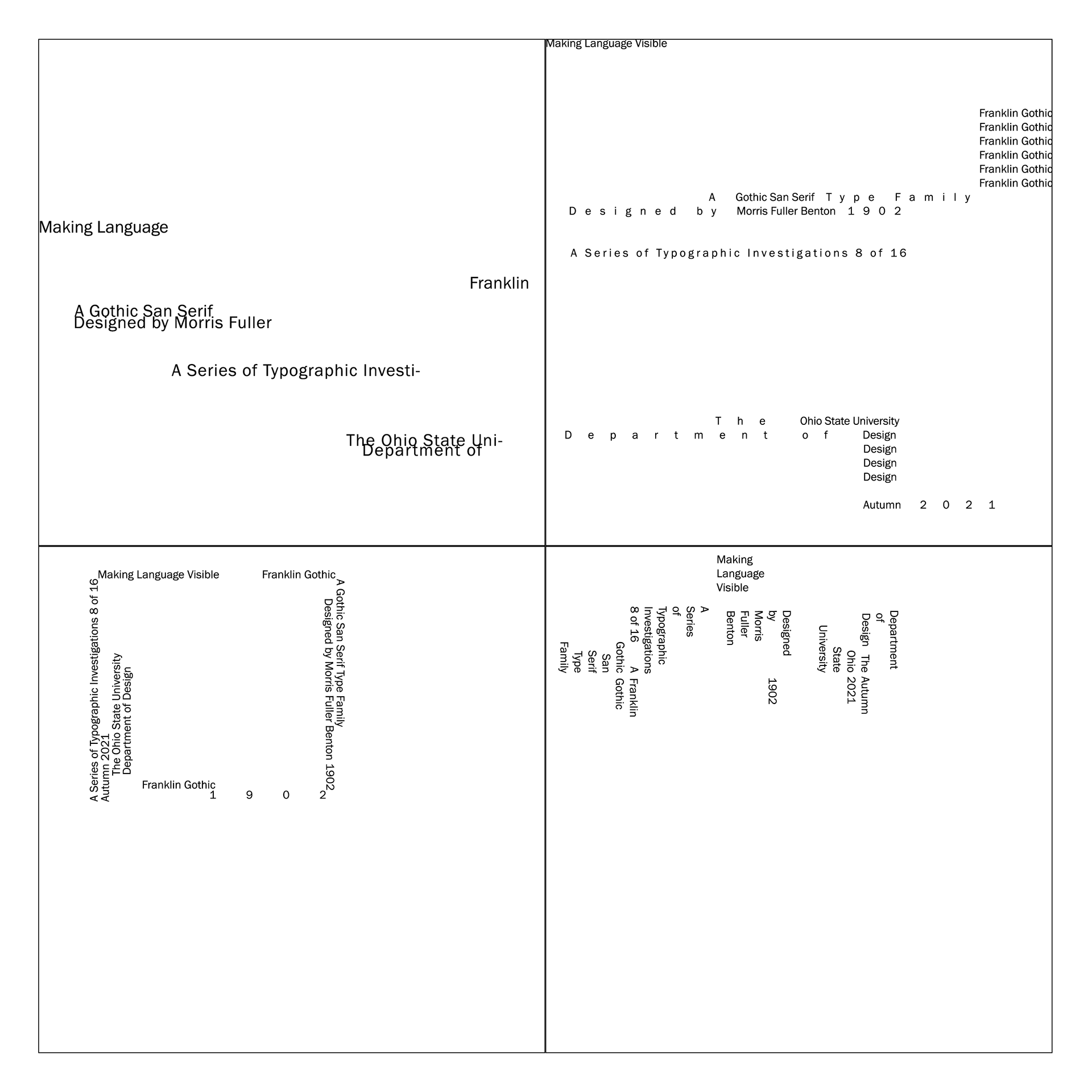
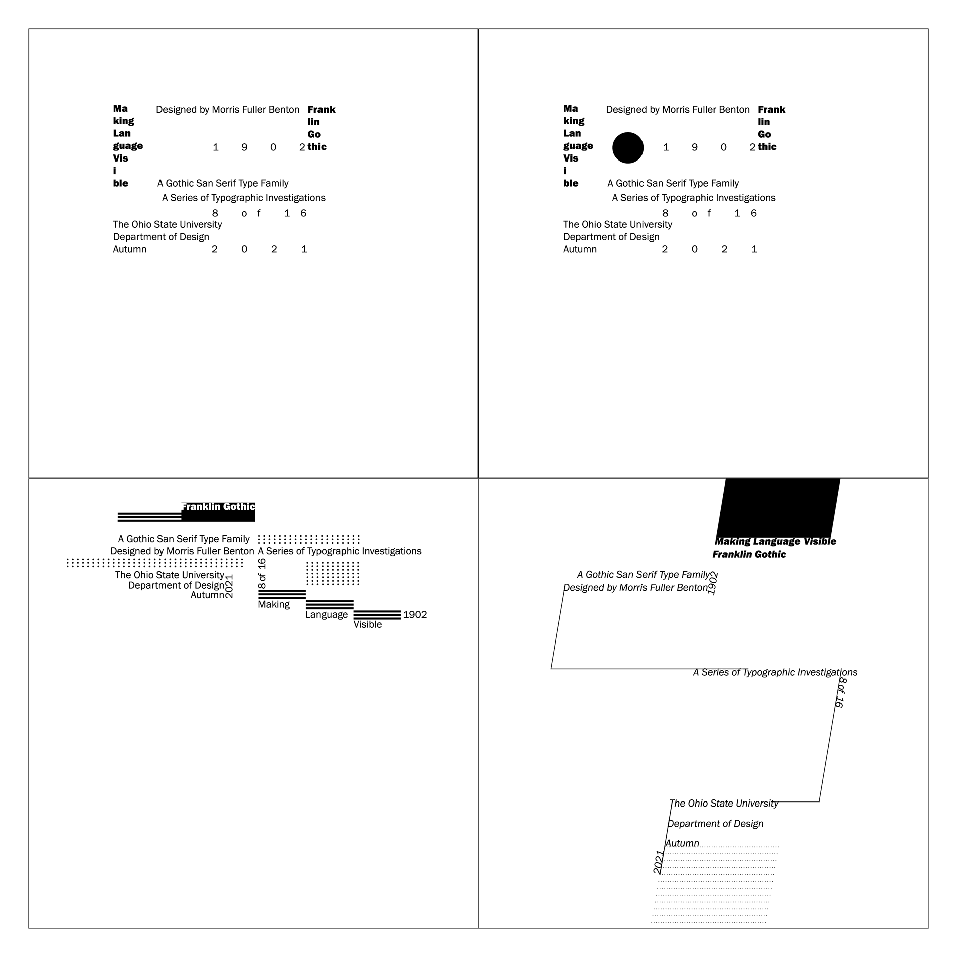
Franklin Gothic
My assigned font for this class was Franklin Gothic. Throughout this book, I explored the form of the letters within the Franklin Gothic family and how to arrange letters and sentences within a spread.
Below are highlights from my book!
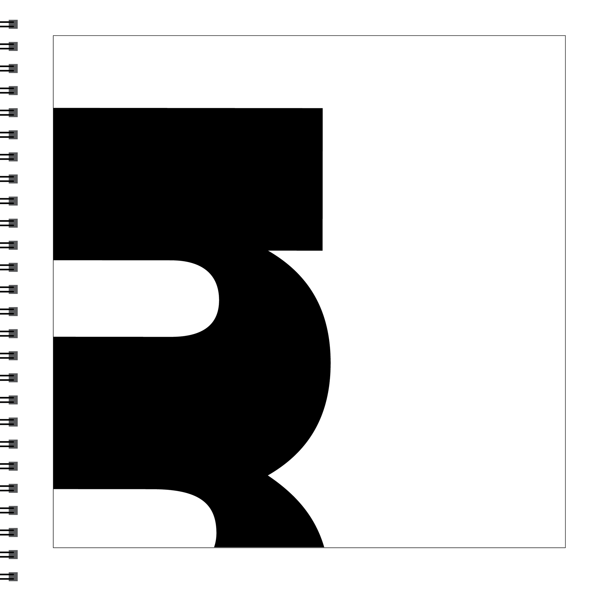
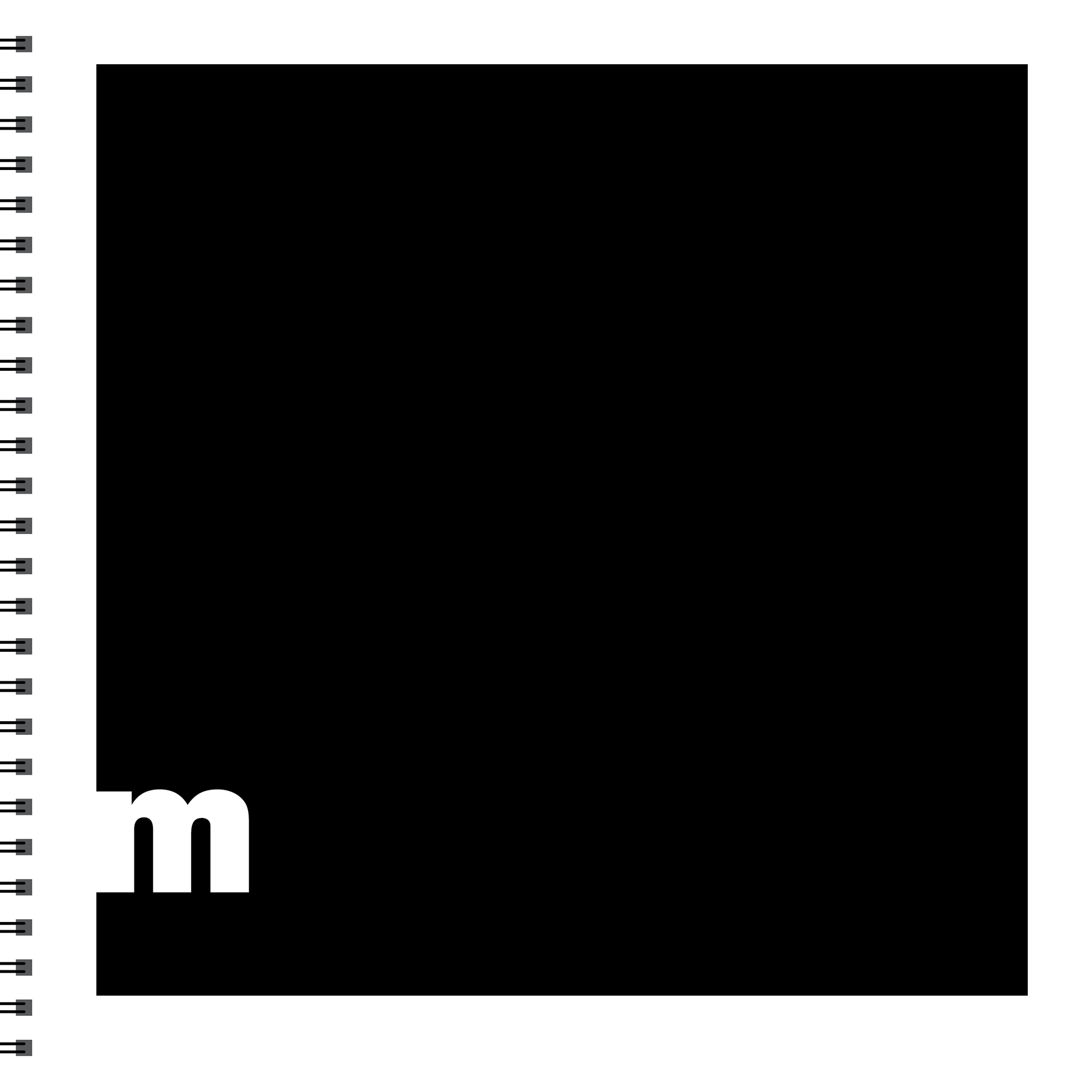
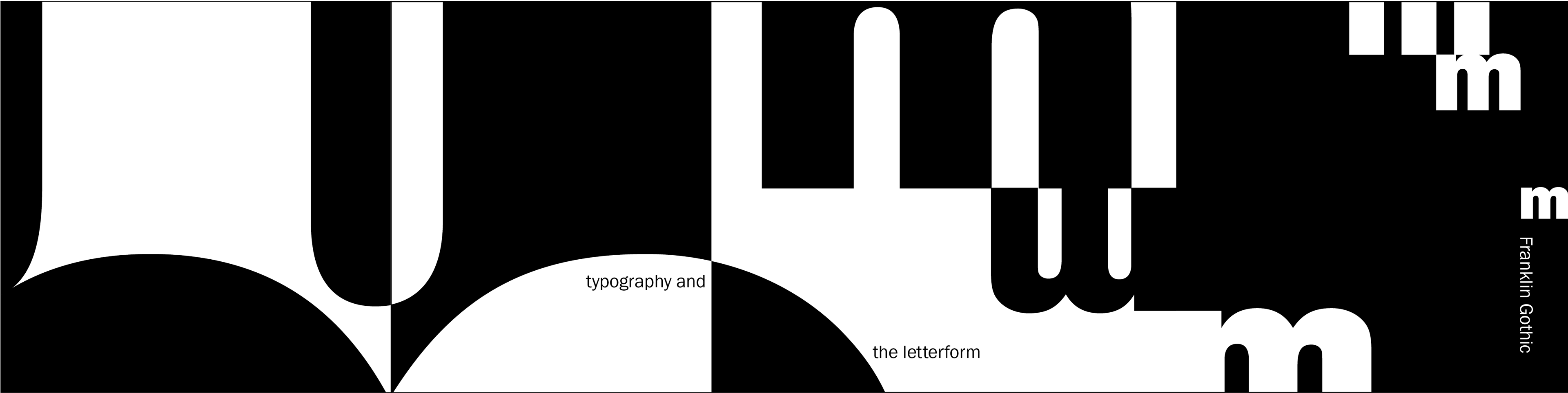
The book starts by exploring the forms of individual letters. The sequence of pages moves from the top left to the top right, and then to the bottom left and bottom right. The first page is labeled Abstraction. This first page represents the most abstract version of the letter m so that the viewer is unable to tell what letter they are looking at. The top right page goes into Clues. This page explores what part of the letter could give the viewer a clue about what they are looking at, without directly giving away the letter. The bottom left page is labeled Distinction and shows the most distinct part of the letter m. By showing the most distinct part the viewer is able to predict what letter they are viewing. Finally, the bottom right page reveals the entire letter in a way that provides a great amount of contrast between the Abstract page and the final Reveal page.
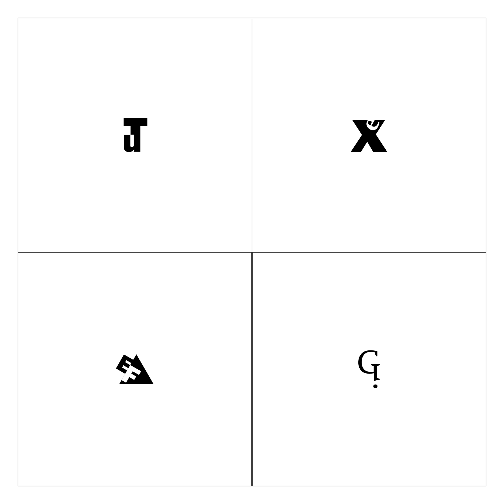
Here I explored how Franklin Gothic characters could merge together with Swift characters. This section explored the forms and counterforms of each letter.
The next section explored how sentences and phrases can be arranged on a square spread. The top two spreads consisted of using only one size, one weight, and horizontal baselines. The bottom two spreads use one size, one weight, and orthogonal baselines.
The last section of the book explored the use of dots and rules. The top two spreads used one size and two weights. These two spreads show the before and after of adding circles and the impact of adding one element. The bottom two spreads use one size and two weights with rules. These two spreads show how rules can break up the text, lead the viewer's eye, and support the grid system created by the words/letters.
Click on the image below to view the full book!